In May 2022, I joined Singulart, an international art and design platform that allows collectors and art enthusiasts to buy contemporary works online. The art sector has been deeply affected by the COVID-19 pandemic, forcing everything to move online: galleries, auctions, showrooms, etc. Created in 2017, Singulart has seen its activity grow rapidly and has raised €60 million in series B funding round in November 2021. I joined the new product team to help them on two product scopes :
Besides my work on those two product scopes, I also worked on and led cross-functional design initiatives to deliver the best Singulart experience possible. In this specific and interesting context of high growth, I decided to reflect back on two typical design challenges growing tech companies are facing :
Role : Senior Product Designer, Project Lead
Period : May 2022 - September 2022
Singulart’s started in 2017 as an online art gallery with the double purpose of empowering artists, and allowing a transparent experience for buyers. In 2021 the company launched an auction sales activity, and in 2022, it expanded its business to the design furniture market. The initial information architecture and navigation system of Singulart, was not designed to scale up, and without any strong expertise in user experience design at the time, the company ended up without any proper hierarchy and priority in its content. The navigation was also weakened by the prevalence of poor design practices such as inconsistent navigation patterns, duplicated navigation elements redirecting toward the exact same content, or excessive use of content display on mouse hover on desktop. Navigating on Singulart was not intuitive and easy to grasp, it was a shared opinion within the company, and enough to justify a proper redesign.
Unfortunately, to approach this project properly, we were missing a lot of reliable data. On the other side, I found it difficult to get relevant insights from navigation user tests because as long as you formalize some tasks (like, “You are searching for an expressionist painting”), your test is already biased. Often, users navigate haphazardly on a website, especially when it comes to highly subjective products like artworks, Singulart being more concerned with a challenge of “discoverability”, than one of “findability”. We decided therefore, to approach the navigation experience redesign with a classic work of information architecture analysis and redesign.
As referred by information architecture advocates, navigation is the tip of the iceberg that sits atop the information architecture of the product. So basically, you can’t have an easy-to-use navigation without a strong information architecture behind it. I divided this work into four main steps :
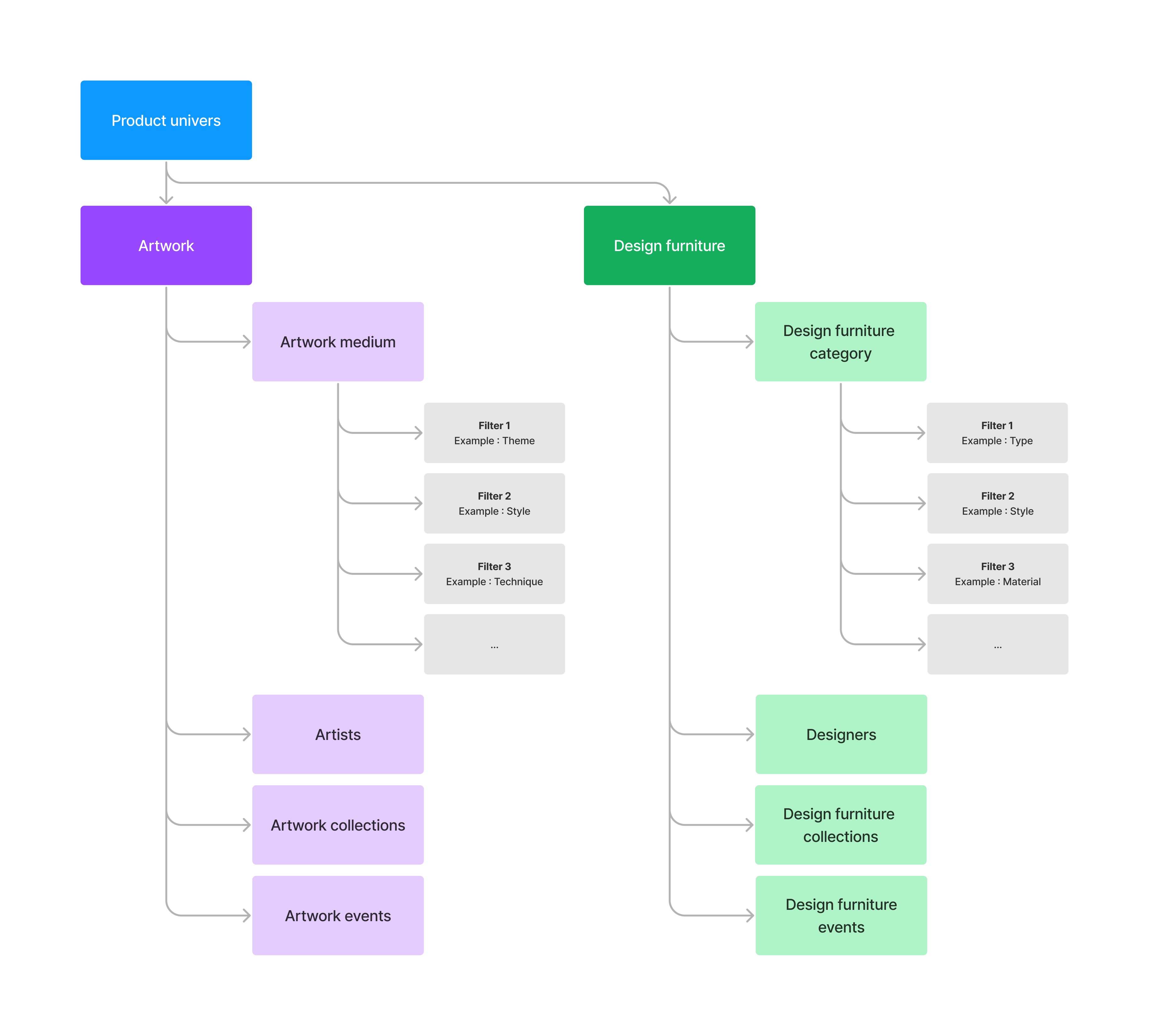
The first step was to identified and listed all the existing content on Singulart to have a clear picture of the information architecture through a diagram.
Then, we evaluate each piece of content: its logical position in the architecture, its usefulness for the users, its accuracy, its tone of voice, and its overall effectiveness. Through this step we were able to find out some issues of different severity, from simple naming inconsistencies (using a different wording for the same content), to more serious categorisation issues (grouping together different content), with a potentially high negative impact on usability.
One of them is worth getting into it more thoroughly: Singulart, wrongly implemented what we call product properties, as mutually-exclusive product categories scopes. Let’s explain this with an example. When you are searching for an impressionist painting on Singulart. “Painting” is an artwork category. As a painting could not be both a "painting" and a "sculpture", artworks categories are mutually exclusive. “Impressionist” on the other hand are what we call combinable filters, they are not mutually exclusive. In our example, “Impressionist” is a painting style, but an “impressionist” painting could also be one of “fine art”, so an artwork category can have several styles, that are defined by the artists themselves when they list their products on Singulart.
This distinction between mutually exclusive categories and product properties were nonexistent in the user experience. Everything was implemented and presented as categories. This over-categorization problem can cause severe usability issues, including (1) :
After having highlighted the weakness within the information architecture, we redefined user-centered groups of content and a standardized naming convention to apply to all site content.One of the key changes was the creation of the “product universe” concept, able to take into account any kind of new high-level activity, or business unit at Singulart, which is currently holding two: artworks and design furniture. If tomorrow, Singulart decides to enter the home appliance or the NFT market, the only question will be: is this a new product universe or just a category from existing ones? The new information architecture with the product universe level is ready to welcome new changes quickly.
With those new user-oriented groups of content, the last part of the information architecture redesign was to estimate how much users will rely on each group of content and how much important it is for them, to give our content the good priority in the website hierarchy. We made a first intuitive prioritisation by confronting our points of view through a workshop, then, we checked user behaviour to inform our intuition with some data.
We concluded that our users expect to discover and buy artworks and design items on Singulart, and therefore we should simply prioritize our product universes. The previous items “artists” (a way to browse all artists on Singulart) and “Collections” (a way to discover artworks through hand-curated collections of works), are not product universes in themselves, but part of the existing ones, so they have been removed from the highest category.
With this initial information architecture work, we have been able to switch to the navigation redesign work with a better vision of our content and its importance for our users. For each group of content, we tried various emplacements regarding their priority, we tested different navigation patterns and components to find out the most suitable, and crafted interaction details with a few prototypes for desktop, tablet and mobile. Our based our new navigation redesign on four principles :
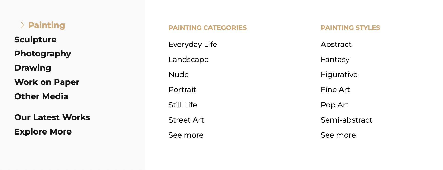
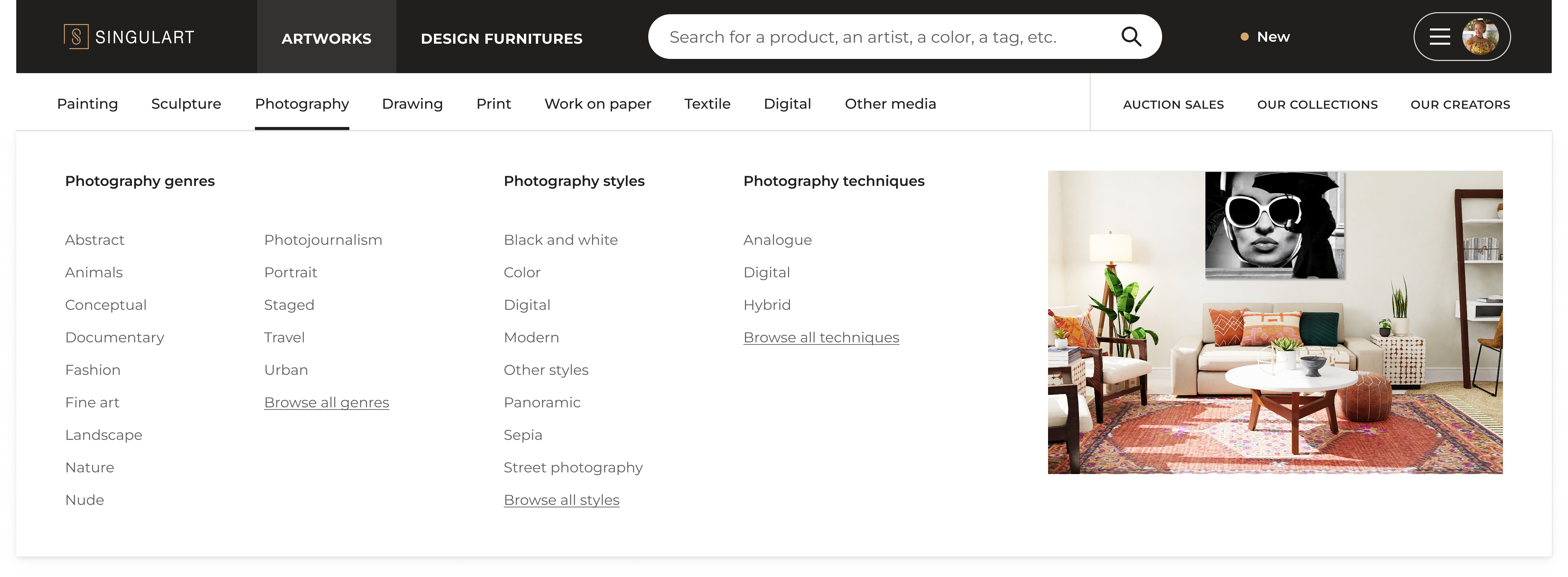
We dedicated the item menu in the main navigation header to our two product universes: artworks and design furniture. Alternatively, our visitors can use the search bar to explore Singulart with the keywords they have in mind.

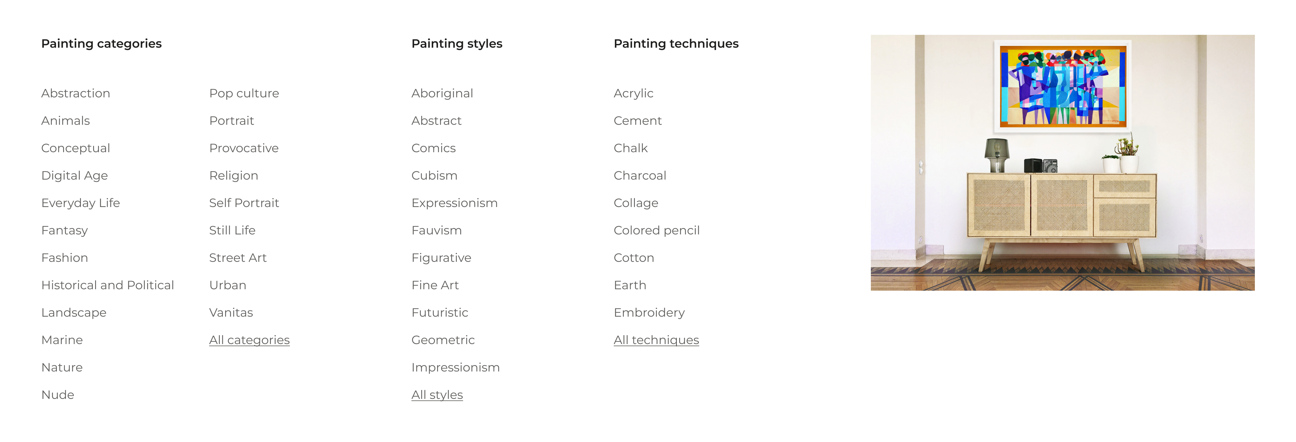
The nine mutually exclusive artwork categories and the six design furniture ones are now available in a fixed second-level horizontal navigation menu. We wanted to make this menu the one and only place to go to navigate categories, instead of having this menu available from different pages, as it was the case before. Alternatively, if our visitors don’t have a specific category in mind to visit, they can also explore Singulart’s through our artists and collections from a fixed right-sided menu, able to handle other alternative items.

From the second-level navigation bar, the question has been raised whether to redirect our visitor to the search results page on click on a category or to display the combinable filters in a dropdown menu on hover. For many usability reasons, I try to limit the use of hover effects to light visual help. Nevertheless, it has been decided to encourage our users to explore our product catalog directly from the homepage by displaying product properties.
Having removed non-product entries from the first level navigation bar (”artists” and “collections”), we asked ourselves: when in their journey, those content would be most useful for our users? We opted for what we call a “just-in-time” cross-navigation. For example, if as a user, I’m searching for black-and-white photographies, we now display the related hand-curated black-and-white photography collection among the search results, using the collection content according to the user query.
All of the four principles of our navigation redesign sound basic regarding the navigation user experience state of the art, but that’s exactly what I think Singulart was missing. With this new navigation, we think Singulart will be able to give its content a clear hierarchy and priority. We think we can partially solve the overcategorization problem by making a clear visual distinction between mutually exclusive categories and product properties. Finally, we removed this tendency of using double navigation patterns to redirect toward the same content, making the navigation experience more stable, reliable and consistent. With everything in its right place, we hope users will feel more confident and better enjoy navigating on Singulart to discover artworks and design furniture they like.
First lesson is a very personal one: I really enjoy working on information architecture. I like the meticulous approach it requires and I can see how this work is linked with more personal interests like analytic philosophy and logic, which is also about articulating concepts as clearly as possible.
I failed at testing the existing navigation with users and didn’t manage to get interesting insights from them. Unfortunately I didn’t take the time to craft other protocols to get non-biased results. Hopefully, I will be able to make it for another project.
Everyone in a company has an opinion about what we should put in the main navigation menu, or want to say something about it. That’s a good thing and as a Product Designer working on it, your job is also to canalize all of this and be extremely transparent and pedagogic about all the work done and the rationale behind the navigation redesign.
(1) - Christian Holst, “Over-Categorization: Avoid Implementing Product Types as Categories”, 2016 (Baymard Insitute)
If you are thinking about building a design system and need someone to lead this project, please contact me.